Are you searching for a great mobile app?
Getting a mobile app that performs well in your niche is a tough job, but not impossible!!
As per the development in the digital world, securing an app that performs well is just half of the battle!!
If you have an urge to make your app shine then an outstanding design is required!!
Design is an integration of your concepts and imagination. Saying that- effective design immerses and good design engages is not wrong. Similar is the case of the application design.
If we talk about the evolution of mobile design- then it is just a decade old. Google Play (Android market) and App store came into the market in 2008, which gives birth to mobile app development.
With the passage of time, it has earned a tremendous growth. It allows businesses to launch their mobile business apps regardless of the business size. Though, several website designing companies are there that can make you aware of the proficient ways to develop an outstanding app.
Surprising Statistics of Mobile Apps
It is estimated that the leading apps enable businesses to generate almost ¾ of the sales because of the updated and high-quality designs.
According to Statist, the revenue of $88 billion was noticed in 2017 by mobile apps. This figure is going to rise in 2020 with $189 billion in revenue.
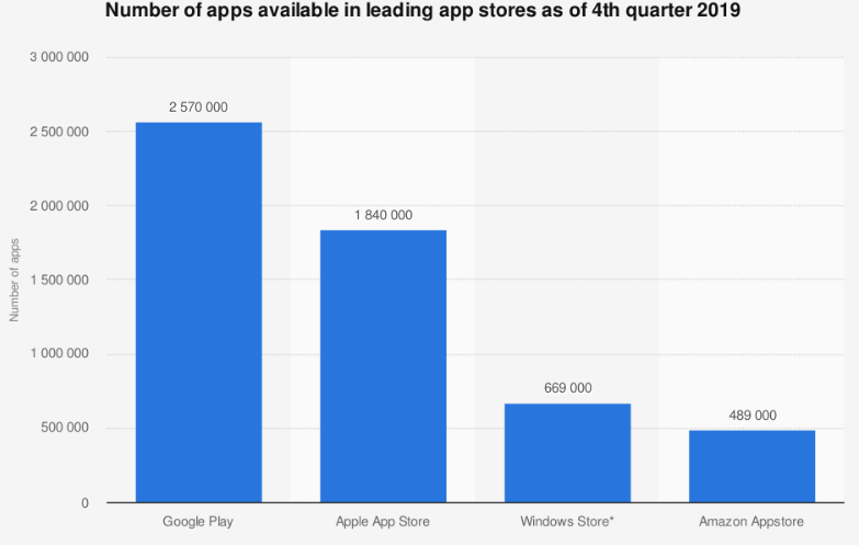
(Source: Statista)
The above graph shows the number of apps available in app stores in the fourth quarter of 2019. From all, the android users have chosen 2.57 million apps. This figure has made the Google Play Store the best among all the app stores.
It is predicted by Sensor Tower that till 2023, the app industry will notice a 16.8% of CAGR. This implies; there will be twice as revenue as in 2018; that is, $156 billion from $72 billion. Though the iOS App Store is still more prominent than Google Play- besides, the gap is proportionally less.
The businesses will continually cover the unparalleled value and reach of mobile. The marketers will spend $240 billion on advertisements in 2020. It is a multiplication of 26% than in 2019.
The above statistics have made this very much clear that mobile apps are going to be in much demand in the future. Keeping that thing in consideration, it is recommended to prioritize the UI and UX of the mobile design. While checking the popular mobile applications, you will notice that the prominent part is minimal design.
Simple is never easy. It takes a lot of effort to combine all the business ideas into one app. So, for your convenience, we have made a list of the tips that you have to consider while designing the mobile app. Let’s get started!!
Tips for Designing an Interactive Mobile App
Pick the Right Platform
The first and foremost thing is to choose the right platform for app (Hybrid or Native) designing. There are several platforms in the market that can choose according to your requirements and budget. The tip here is to draw an outline about the elements that you want your mobile app to have. Then, only you choose the platform. It does not let your money and resources to waste.
Some mobile app development platforms that you can choose are; Appery.io, Mobile Roadie, TheAppBuilder, Good Barber, Appy Pie, AppMachine, GameSaladl BiznessApps, AppMakr, and ShoutEm.
Read more : How Much Will I Pay for Mobile App Development in 2020?
Use the Grid to Design the App
Grids play a key role in designing a mobile app. Nevertheless, it could be invisible, it is worth it. Grids give you significant resources for fixing the spacing. This act will make your app layout organized and clean.
It enables you to check how the app will appear in the end (after the completion of the design components). Assure that the images and the text are not overlapping – setting and defining the margins on the grid will surely work positively.
Pay Attention to the Color Choice
Keep the colors combination simple and understandable. Color does reflect the aim of your brand. Hence, paying attention to this aspect is mandatory. Contrasting and bright colors will not engage the audience at all. Do not hurt their eyes with flashy or shiny colors. Use only the general color combinations and let them create the magic.
Like; if something implying “Yes” is reflecting by Green color and “No” or “Exit” buttons are reflecting with the Red color, then it sounds appropriate.
But, if you will use the reverse color combinations, then it surely will confuse the audience. Do not let your engagement rate suffer. Use only the general color combinations and let them create the magic.
Website Loading Speed
Complex design hampers the app speed. It will decrease the speed by which the app is loading. And, it is known that the visitors do not wait for long. Consequently, they move to other apps. App taking more than 3 seconds to load increases the bounce rate to a large extent. Check out below how your speed is related to the bounce rate.
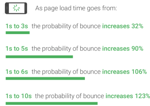
Indeed, it is a serious issue. You need to act before you suffer a lot. The tip here is to simplify the app design- it inevitably will maintain the app loading speed. This will improve and stabilize user engagement.
Mobile App Accessibility
What about the size of the buttons? You have to keep their size appropriate, orderly, and place them in the required position. Make the buttons such that the users click on the right part of your mobile screen.
Here, you have to work also on the accessibility factors for users with disabilities. Make them alter the screen text size if they are visionary impaired.
Also, guarantee that the other essential app factors also fit in the mobile screen appropriately. Else, your images and text will overlap, which makes the mobile app look clumsy. Do not let this happen and maintain accessibility.
Take Help from the Resources for the Layout
It is always not required to make the layout from scratch- you can if demand persists!!
But, with an immense amount of online resources available, you can design the mobile app effortlessly. You can take assistance from the Mobile Patterns. Digitization has given us a lot of layout resources that you can use. Some websites, like, Pttrns, Inspired UI, Cocoa Controls and Lovely UI, can be checked out.
Easy Navigation
Do not let your mobile navigation irritate your visitors. Make it easy and simple.
Several apps opt for different means to navigate from one page to another. They use the image blocks that get the bullet formats or clicked with the text.
Adding several types of menus is also possible on the screen. It also gets expanded menus that save a lot of space on your app screen.
It is not about how you have outlined everything on the app, try to keep the navigation as simple as possible for the visitors. Do not let visitors do much of zooming, scrolling (left/right, or side) to check the content on every page.
Responsive Design
What is the other important thing that one cannot overlook? It is responsiveness!!
So, while making a mobile app, keep it compatible with several devices. If your app is not responsive, then you will lose the utmost amount of users. It would be better if you will test its compatibility with several devices (Android and ioS) to assure its responsiveness.
Update your Mobile App Design Regularly
Obviously, you do not want your app to be boring or old. The prominent mobile app developers have shown up many ways to boost the app performance for the updates. But, assure that you are not making several changes that the audience is not ready to taste, mainly when your app is knowledge-oriented.
And, if your mobile app is not a leading one, then, the users have many choices, they can choose the one according to their preference. Do you want this to happen? No, Right!! So, it is essential to update its design with the necessary changes.
Use Negative Space
It is not always necessary that whatever is created is fully saturated. Negative spaces can be used on the pictures, text, and in the other parts of your design.
It would be best if there is some space within the columns and negative space in the margins. Give designing some space to breathe and make it look engaging and appealing.
Maintain the Flexibility
Give a positive customer experience with a flexible or consistent mobile app design. Each element should be placed in such a manner that it guides not misleads. Do not allow it to change the interaction rules.
Every app page has to be supportive of its idea and core style. The menu buttons or the layout should have some functions that should be repetitive on each page.
Modifying the design (Color or size) of some element of every page can confuse the visitors. They might end up selecting the wrong button or performing undesirable actions. It gives rise to some errors and can discourage the visitor experience.
Now, it’s your turn to act!
We have mentioned the best tips that you should leverage if you are planning to design a mobile app.
We cannot deny that mobile apps are giving a tremendous amount of business, particularly for the developers and the designer’s hybrids.
Hence, those who are well-known about the mobile app statistics should get a mobile app with a prominent design. Earn credibility and thrive!!
Hopefully, you liked this article. If there are more tips that we should know, then do share with us in the comment section below. Do share your ideas with us!!
Thanks for reading!!


